A password users had to remember
The old journey defined a password for future entry after verification.


From password-based return access and ambiguous document capture to a clearer, device-aware authentication and identity-verification journey.
The Product team surfaced the initial problems through existing signals and user feedback. I reviewed the full customer-definition journey with the team.
The issues were not limited to one field. They appeared across return access, card and receipt capture, signature input, and a long mandatory information form.
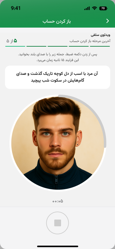
Video verification already existed; our work focused on restructuring its guidance and place in the wider flow.
The old journey defined a password for future entry after verification.
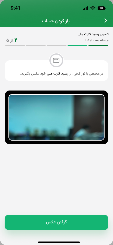
Without a physical card, users had to upload the same receipt twice as the card front and back.
Card and signature inputs gave too little spatial guidance—especially on smaller devices.
Required supplementary information was presented as a single, demanding page.
My role was Design Lead, Reviewer, and Decision Partner. I was not the primary execution designer or the test moderator.
Designed the flows and UI, then brought each flow into review when it was ready for critique.
I reviewed flows, compared alternatives, identified validation needs, and helped decide how findings should change the design.
Owned the moderated testing work with support from Mehrnoosh. I reviewed the findings and outputs afterward.
We had improved hierarchy, copy, and guidance, but the solution still carried assumptions that needed to be tested.
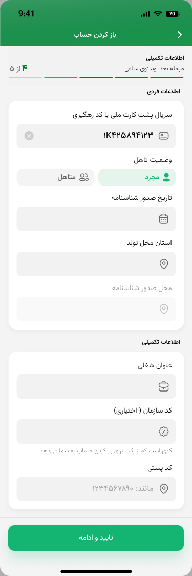
The supplementary-information screen shown here is one step inside the full journey. It is not the initial version of the entire flow.

The earlier experience asked users to create and remember a password after verification.
This is the supplementary-information step inside the flow—not the initial version of the whole experience.
This intermediate solution was created before testing and still needed validation around serial and tracking-code language.
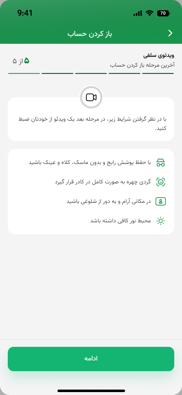
Video verification already existed; the intermediate design reorganized its guidance and expectations.
This screen belongs to the solution that was prepared before the first usability-test round.
Participants completed login or identity-verification tasks while thinking aloud.
The team captured hesitation, confusion, errors, and friction. I reviewed the findings and outputs; I did not moderate the sessions.
Hero findingOur first solution was still confusing.
The clearest example was the distinction between the national ID card serial and the receipt tracking code. Testing showed that better-looking UI had not yet created a reliable mental model.
The final journey addressed access, document states, capture guidance, signature space, and the structure of mandatory information together.
It was then tested again before handoff and development.
Instead of defining a password, users authenticate on first use of each device. Later entry uses fingerprint or Face ID; older devices continue through username-based access.
Users whose national ID card has not arrived get a dedicated receipt path and capture the receipt once.
Each side of the national ID card has a specific framing guide so users can place the right image in the right area.
We increased the signature area to reduce the difficulty users experienced on smaller devices.
Because the data was mandatory, we kept every field but split the supplementary information into two sections with clearer progress.
Leadership principleA design review should create room for evidence to challenge the team’s assumptions.
The refined experience was tested again, handed off, and entered development.
It did not reach production, so this case makes no conversion, completion-rate, or post-launch impact claim.
Main learningBack to selected workUsability testing should challenge a design, not validate the designer.